—
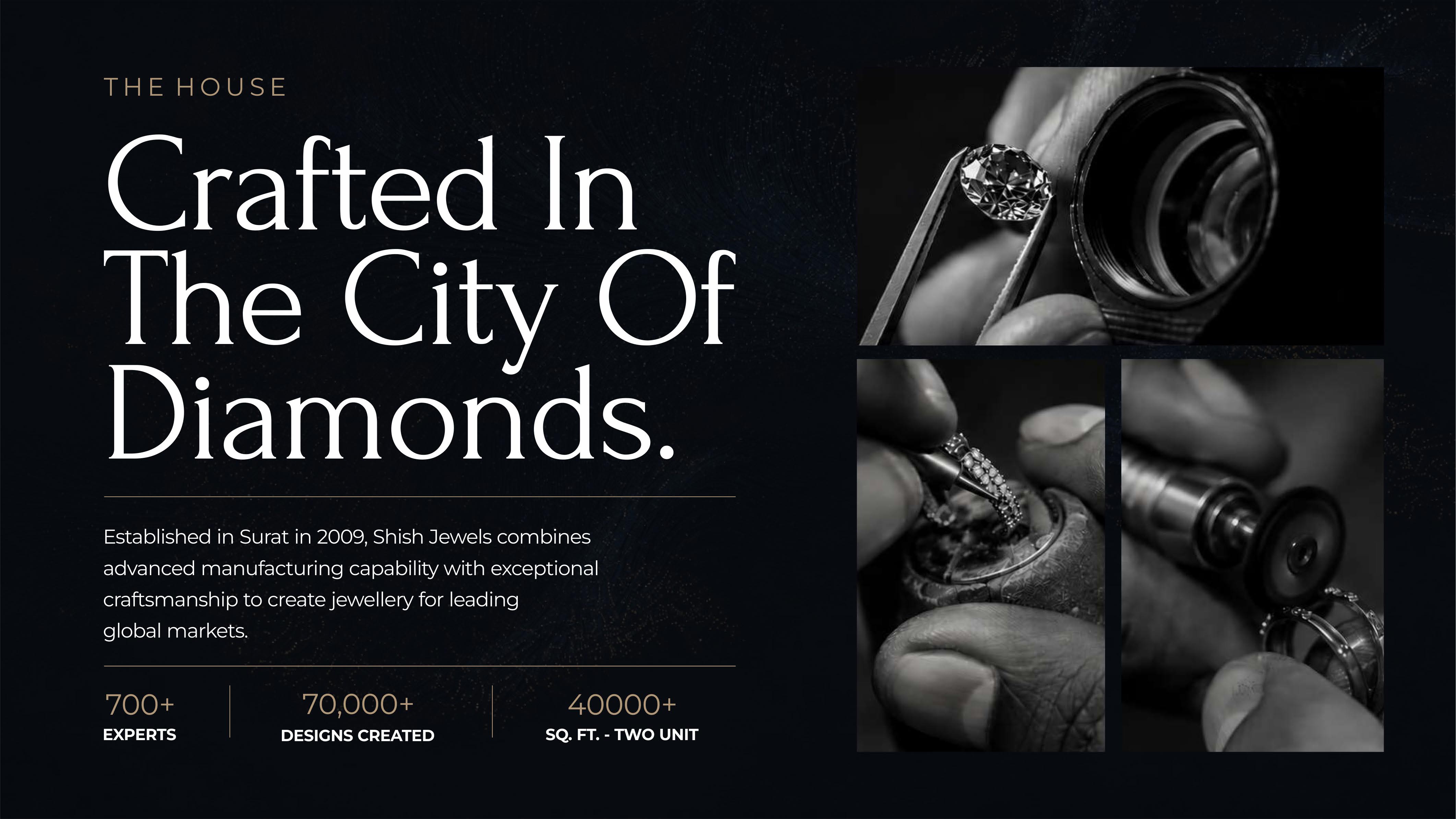
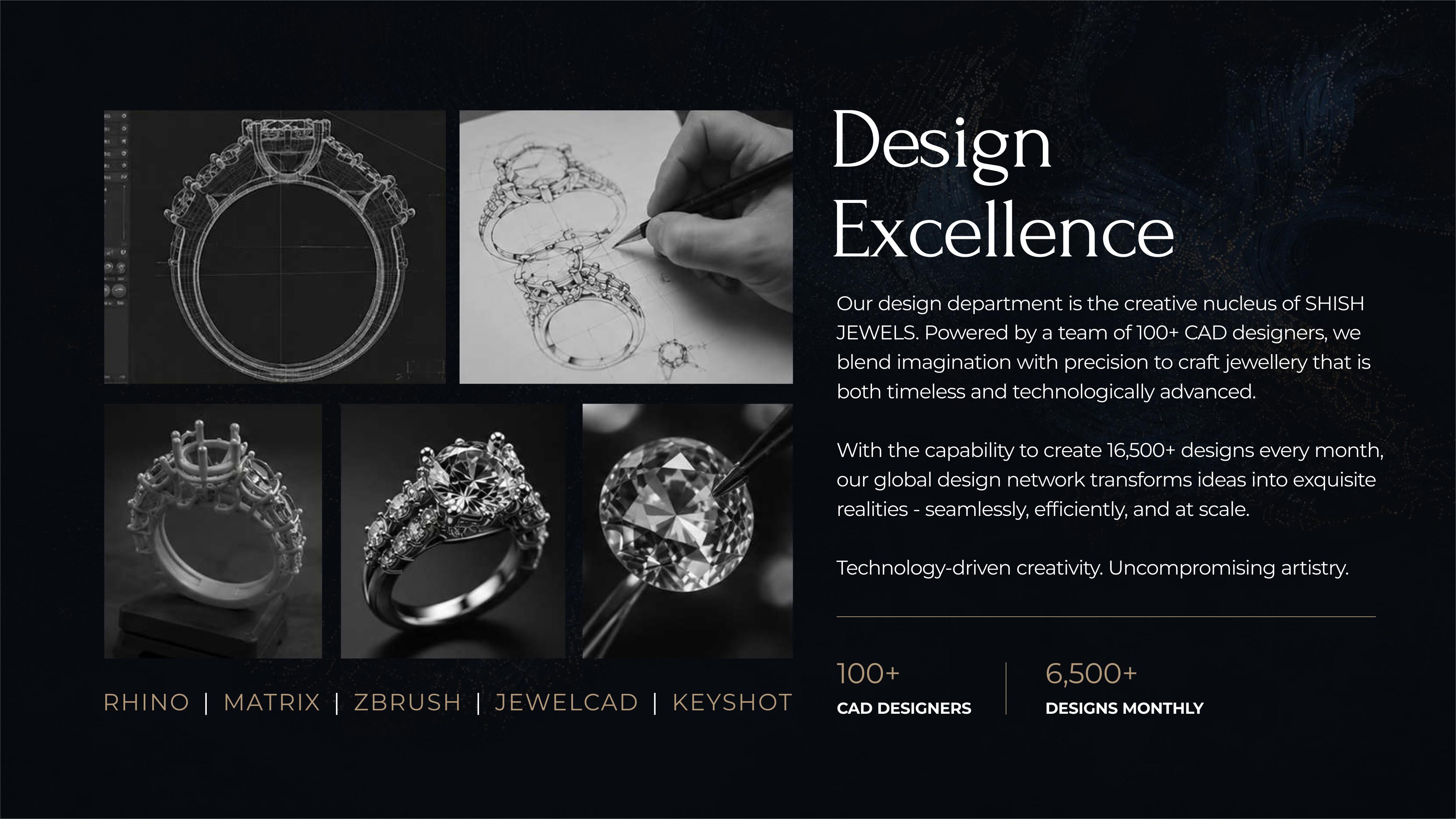
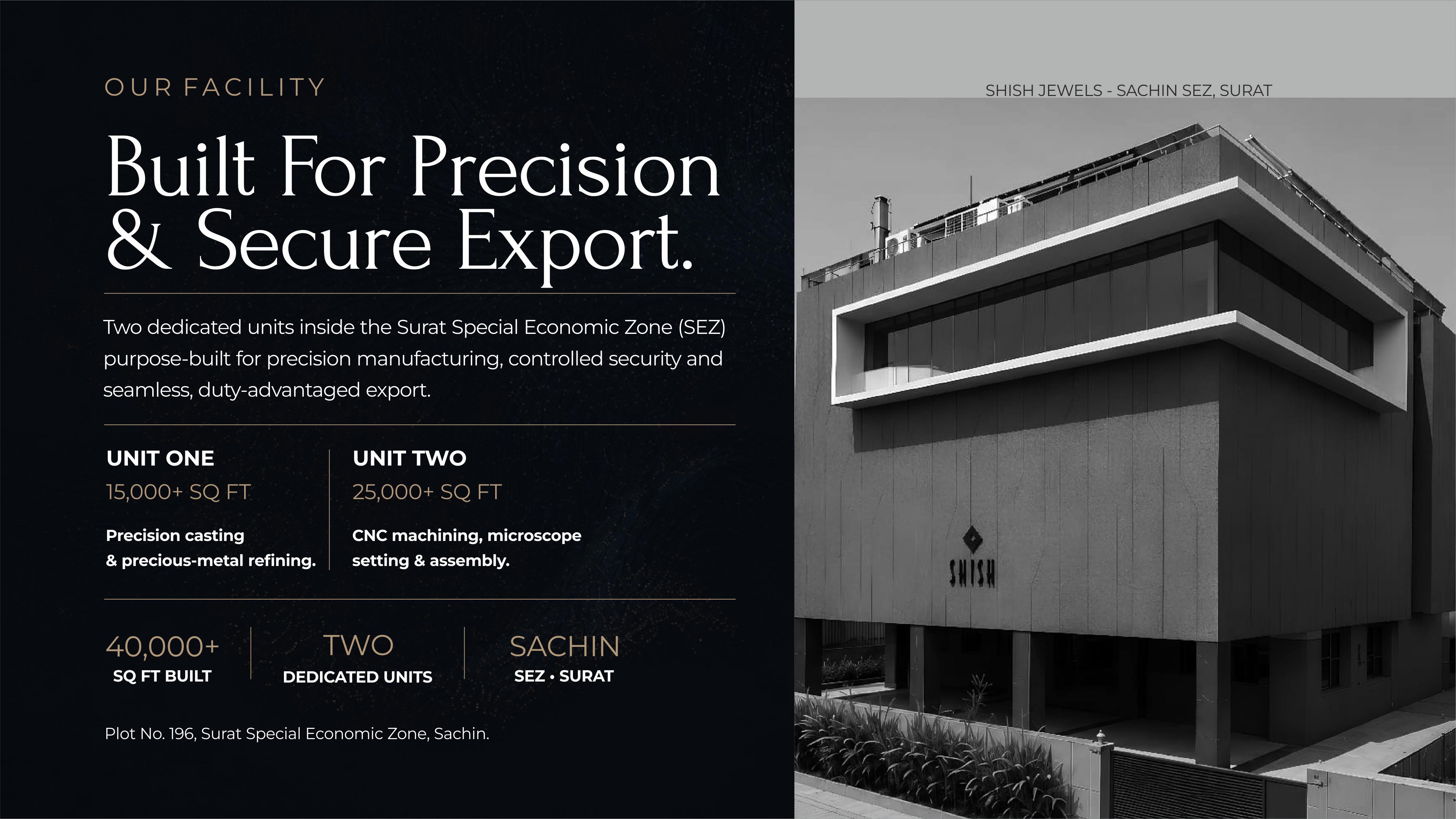
The visual language draws on the jewellery itself — gold as a structural element, not decoration; negative space used generously; photography placed to communicate craft and materiality. Typography is set in a narrow serif for headings and a clean roman for body text, with generous margins throughout. The presentation was designed to be read slowly, not scanned — which is the only pace that works for jewellery of this quality.